top of page
AGROHUB TBILISI
/ Supermarket, Georgia
Client
Agrohub
Format: Supermarket
Square: 2176 м2
Location: Tbilisi
What was done
Retail and visual concept
Technological Project (Technological plan, Floor Plan, Technology specification, Technology connection points, Equipment specification, connection points plan)
Story
The Georgian market and mentality have their own characteristics, which we took into account and accented in the new concept.
Georgians are very fond of markets, so we created the presentation like in markets.
The length of the meat category is very non-standard, because the showcase should be very impressive. Almost 2 meters of one farm chicken. That's cool.
Another mental feature is openness with a sincere heart. Also, all our own production facilities are fully open - this is the way we show that we have high-quality, fresh, prepared here on the spot.
Hot deli is planned according to the principle of a show kitchen - we literally invite guests to our kitchen - here the culinary processes are almost all in the trade zone - cutting, kneading, cooking, and the showcases have stoves on which the food is prepared - all this looks very attractive and you want to taste it.
Following the locality trend, we highlight the national one - in Georgia, of course, this is local tandoori bread.
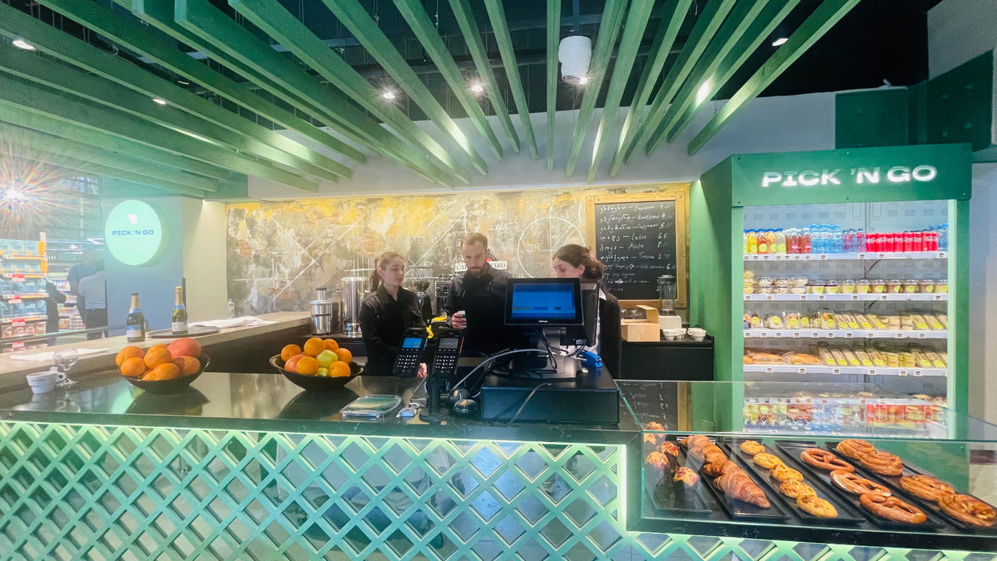
We also have added completely new categories that did not exist before - a bar with strong coffee and snacks to go. In this case we build the image for younger audience.
In design approach the idea was to keep true spirit of Agrohub, but to add modernity.
The concept is unique itself as we deliver market offer straight to the consumers apartments - you don’t have to drive anywhere else to buy natural products.
The planning is consumer oriented. We made 2 entrances for both car and walking traffic. The placement of the departments is not common as we greet consumers straight with our key farmer zones - Farmer Fruits&Vegs, Farmer Meat and Farmer meat and cheese delicatesse. Consumers will find all farmer products in one zone.
The concept is based on the Ultramarket brand itself. It contains many deep meanings. Ultra means “more than”, referring to the variety and exclusivity of the product offer. With the design, we literally metaphorically demonstrated the dynamics and variety that Ultramarket offers to its guests.
The design uses a mixed design style, there are no monotonously similar sections and signs, as in many supermarkets, all areas are different, but connected by general line with an emphasis on naturality and craftiness.
We used art objects to strengthen emotion in each department.
bottom of page


